Sankey Diagrams
This lesson covers:
- What a Sankey diagram is
- How to do calculations with Sankey diagrams
Sankey diagrams are a visual representation of all the energy transfers taking place in a process. The thicker the line or arrow - the greater the amount of energy involved. |
 |
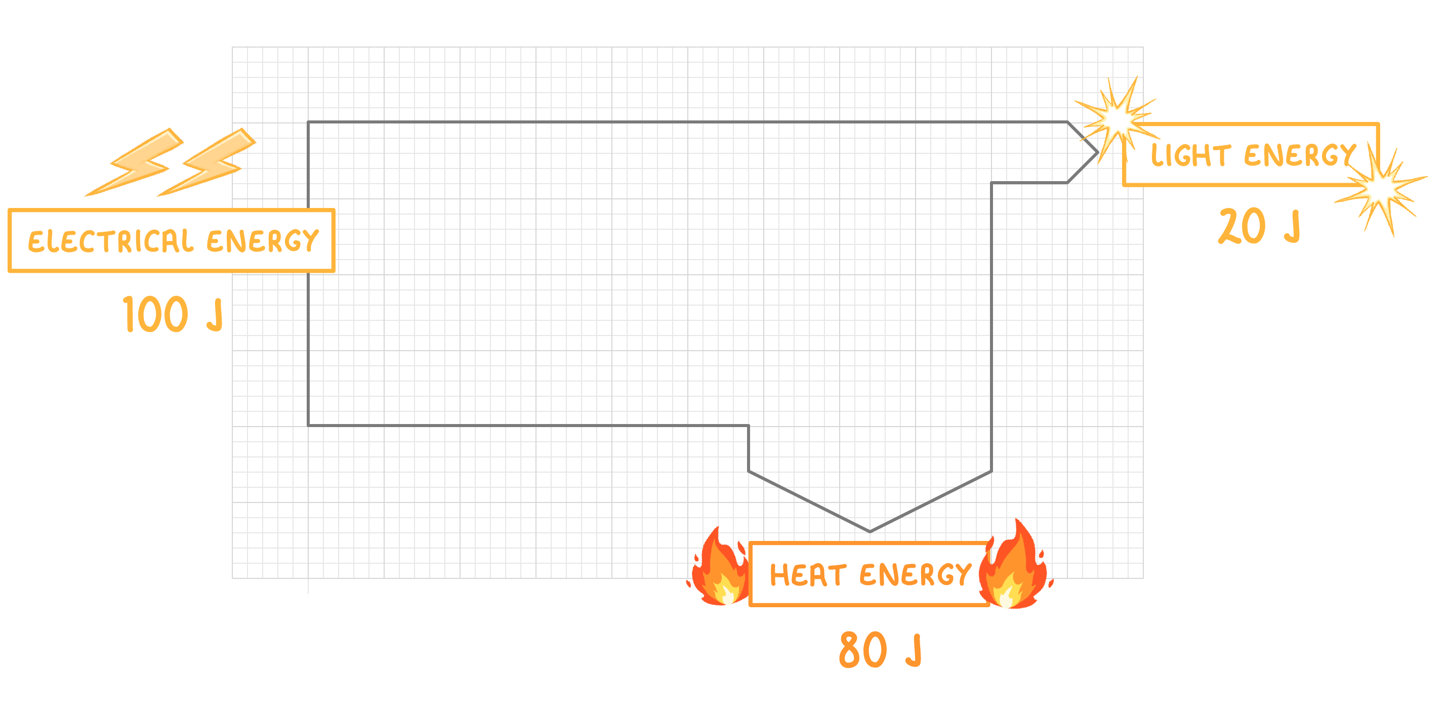 A Sankey diagram for an electric lamp is shown above. It shows that most of the electrical energy (100 Joules) is transferred as heat (80 Joules) rather than light (20 Joules). |
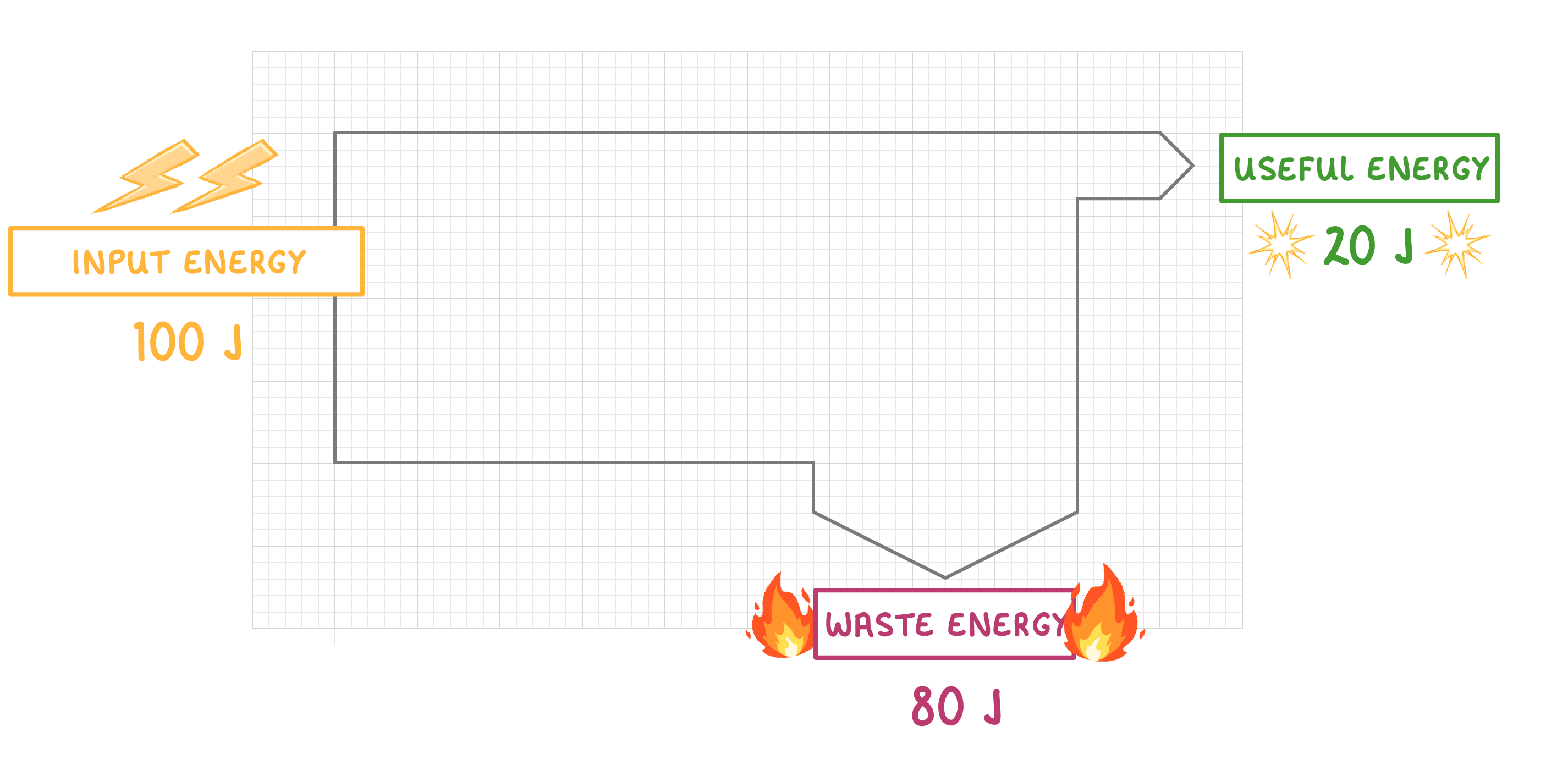 In the case of this lamp, the energy that is transferred as light is considered 'useful energy output' - but the energy transferred as heat is not useful for providing light, so is considered 'waste energy'. |
Sankey diagrams are normally drawn to scale: |
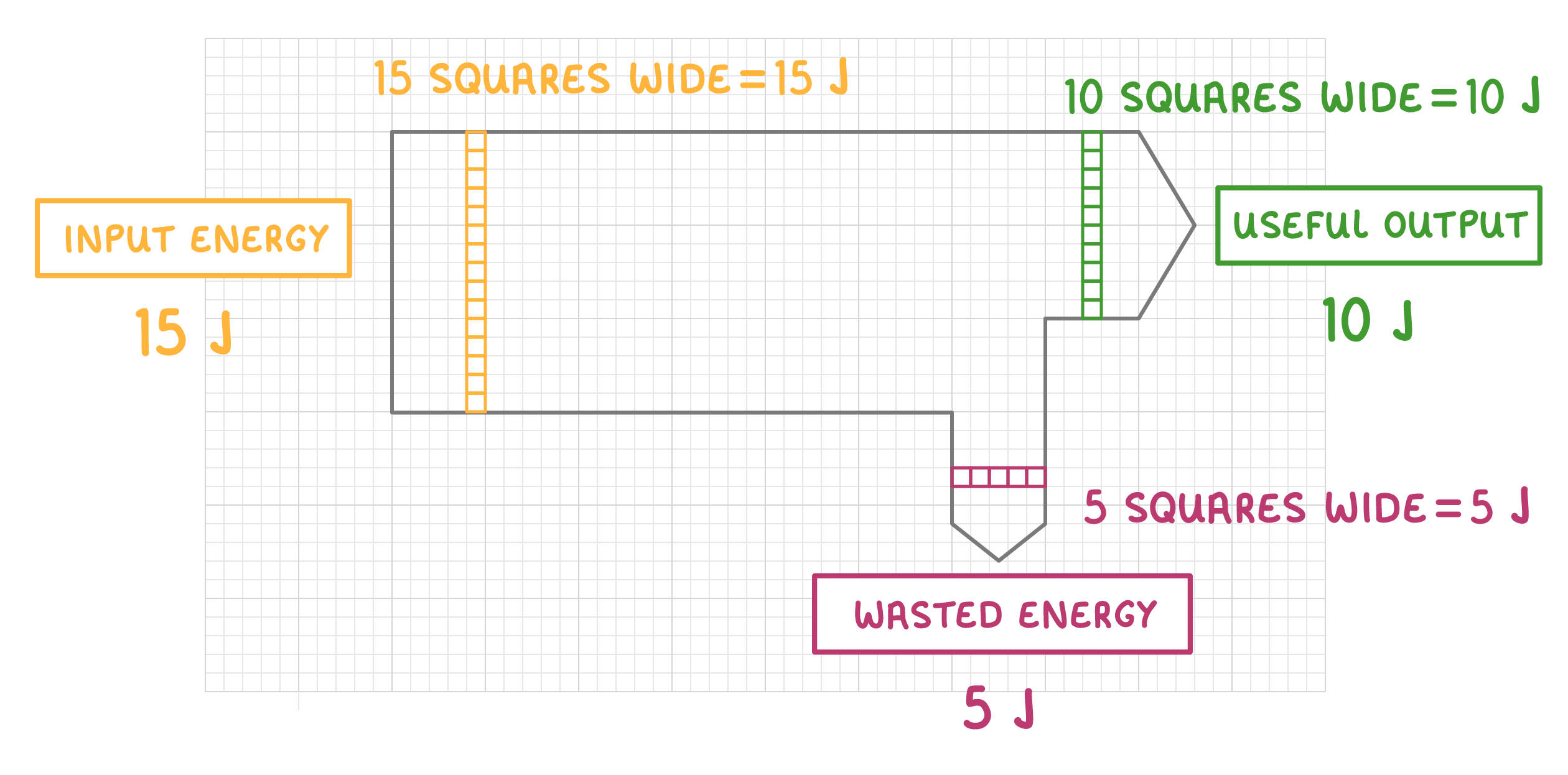 For most Sankey diagrams, the width of each arrow is directly proportional to the energy value it represents. In this diagram, each square of an arrow's width is equal to 1 Joule of energy. |
What type of diagram is used to show energy flows?
Sarcher diagram
Sankey diagram
Sotchi diagram
|
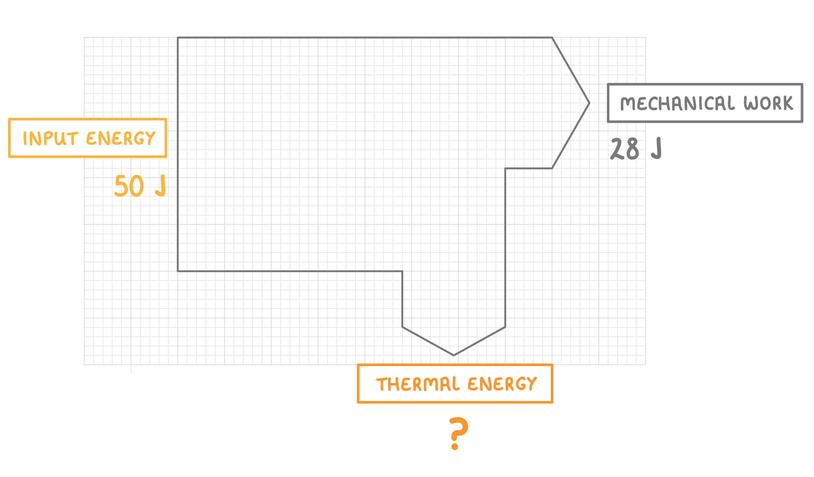
The diagram above shows the energy transfer for an electrical motor lifting a load.
How much thermal energy does the motor produce?
J
|
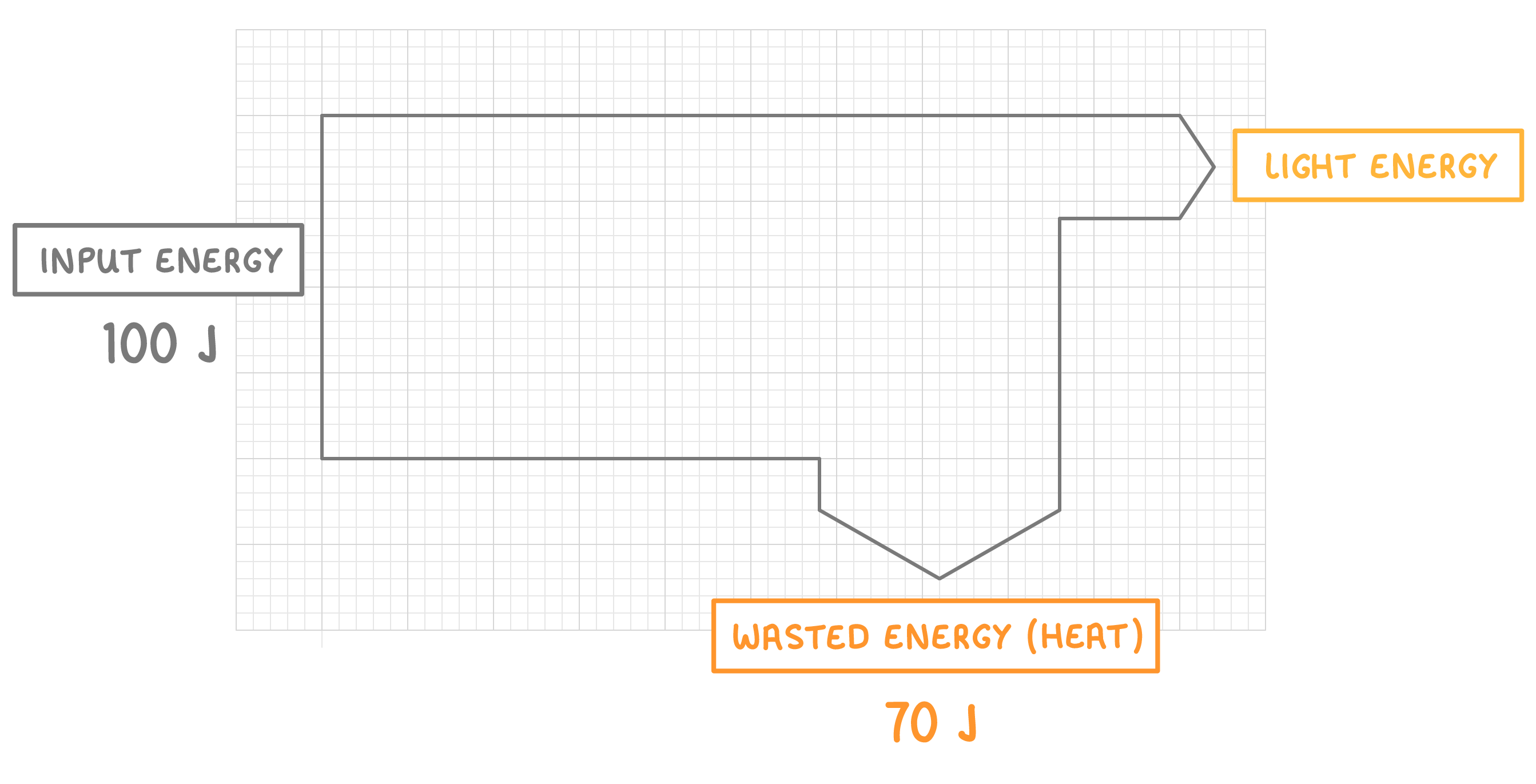
This Sankey diagram shows a bulb with an input energy of 100 J. 70 J is wasted as heat energy.
Calculate the useful energy output of the bulb.
J
|
As well as the flow of energy (joules), Sankey diagrams can also be used to show the power (watts) of a system.
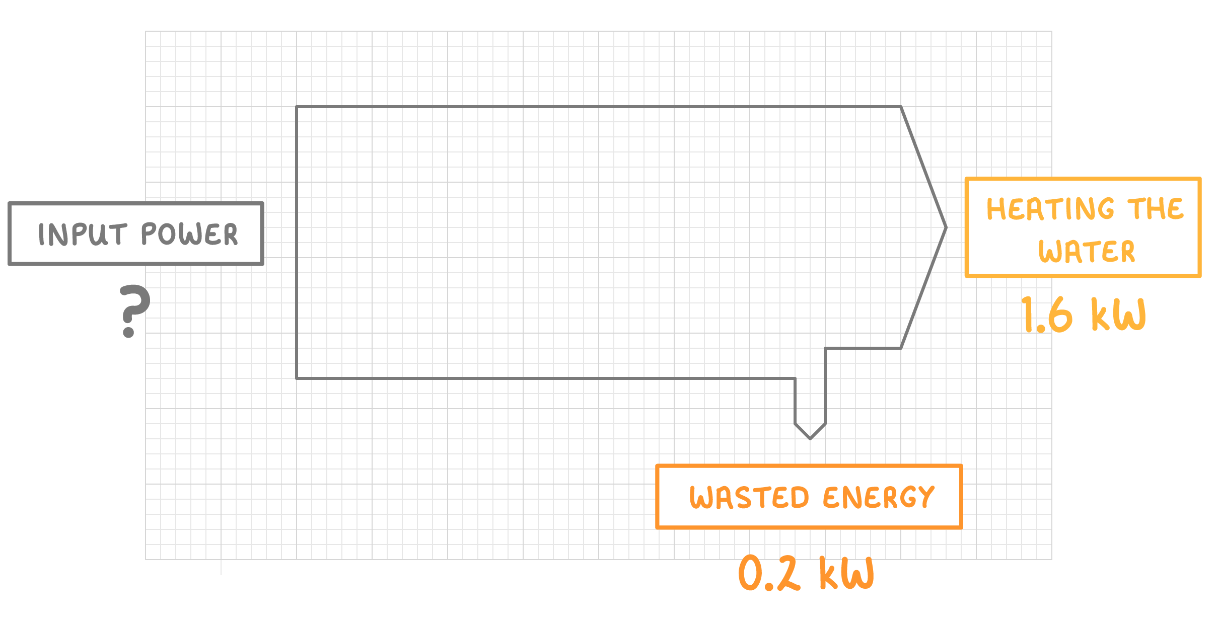
Above is a Sankey diagram for a kettle.
What is the input power of the kettle? Give your answer in kW.
kW
|