Scatter Graphs
This lesson covers:
- What a scatter graph is
- Types of correlation
- How to use a line of best fit to make predictions
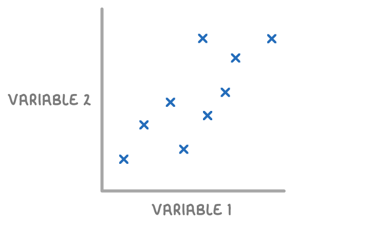
What is a scatter graph?
A scatter graph is a type of graph used to show the relationship between two different variables. They are also known as scatter plots or scatter charts.
One variable is plotted on the x-axis and the other is plotted on the y-axis. The data points are represented as either dots or crosses.
Types of correlation
If there is a pattern shown by the data, we say there is a correlation between the two variables.
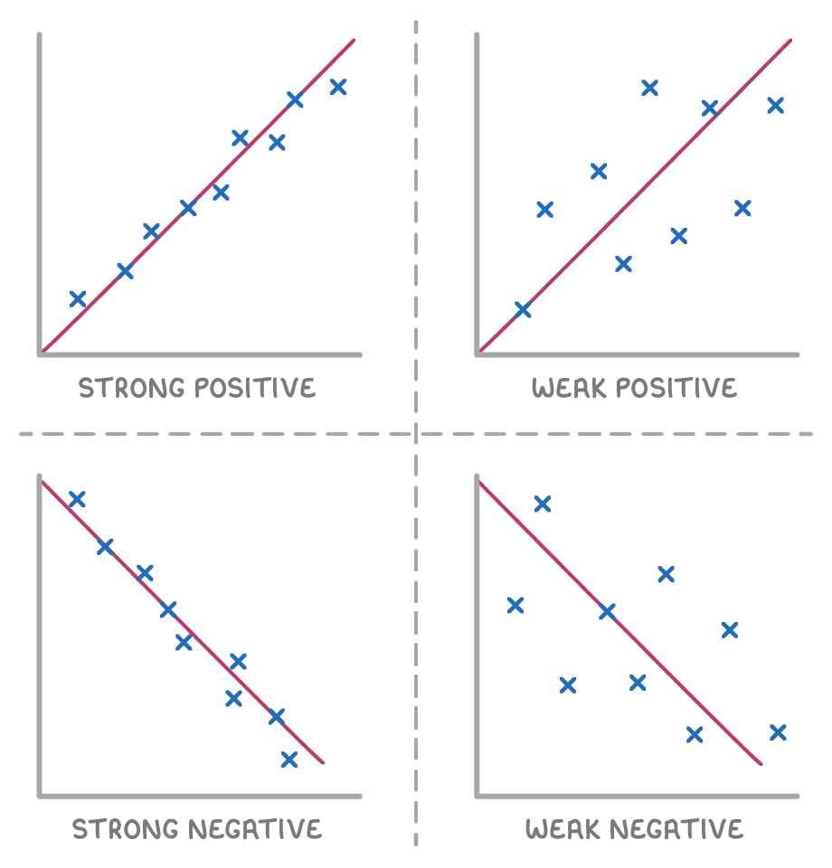
Types of correlation:
- Positive correlation - As one variable increases, the other variable increases.
- Negative correlation - As one variable increases, the other variable decreases.
- No correlation - When the points are spread out randomly with no clear pattern.
Strength of correlation:
- Strong - Points lie close to a straight line.
- Weak - Points are spread out but still form a general trend.
What type of correlation is shown by the scatter graph?
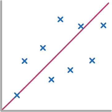
Strong negative
Weak negative
Weak positive
Strong positive
No correlation
|
What type of correlation is shown by the scatter graph?
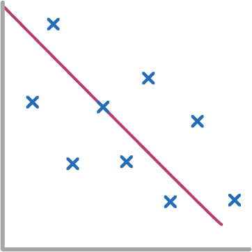
Strong positive
Weak positive
Weak negative
Strong negative
No correlation
|
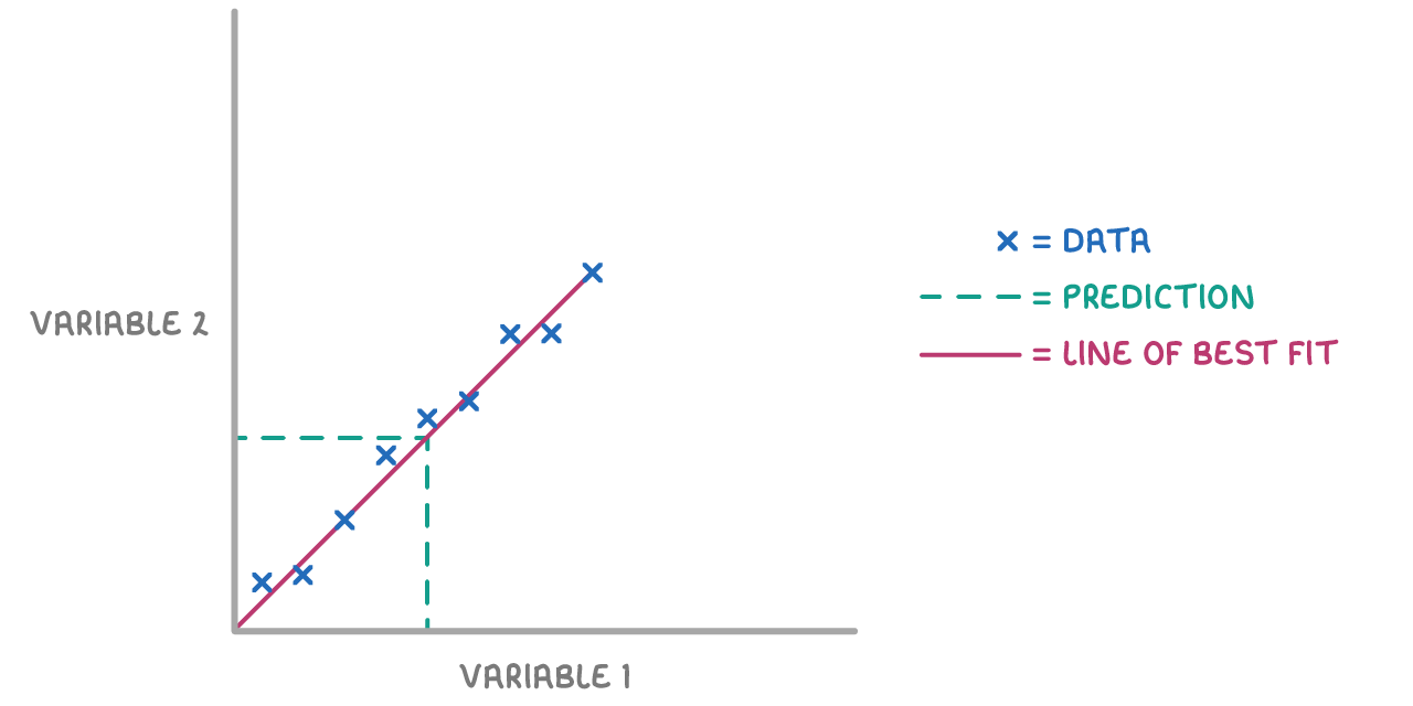
Using a line of best fit for predictions
A line of best fit can be used to make predictions about the value of a variable.
Interpolation:
If the prediction lies within the data range, we read off the value using the line of best fit. This method is known as interpolation.
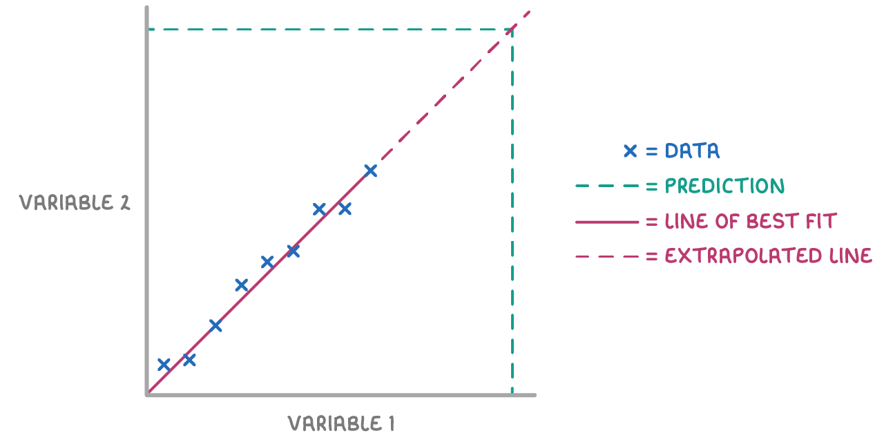
Extrapolation:
If the predicted value lies outside of the data range, the line of best fit can be extended. This method is known as extrapolation.
When making predictions outside the data range using extrapolation, the result is less reliable than predictions made using interpolation. This is because we don’t know if the trend holds beyond the range of our data set.
The scatter graph shows some information about 8 cars. For each car is shows the engine size, in litres, and the distance, in kilometres, the car travels on one litre of petrol.
Estimate the distance travelled by a car with a 2.5 L engine size.
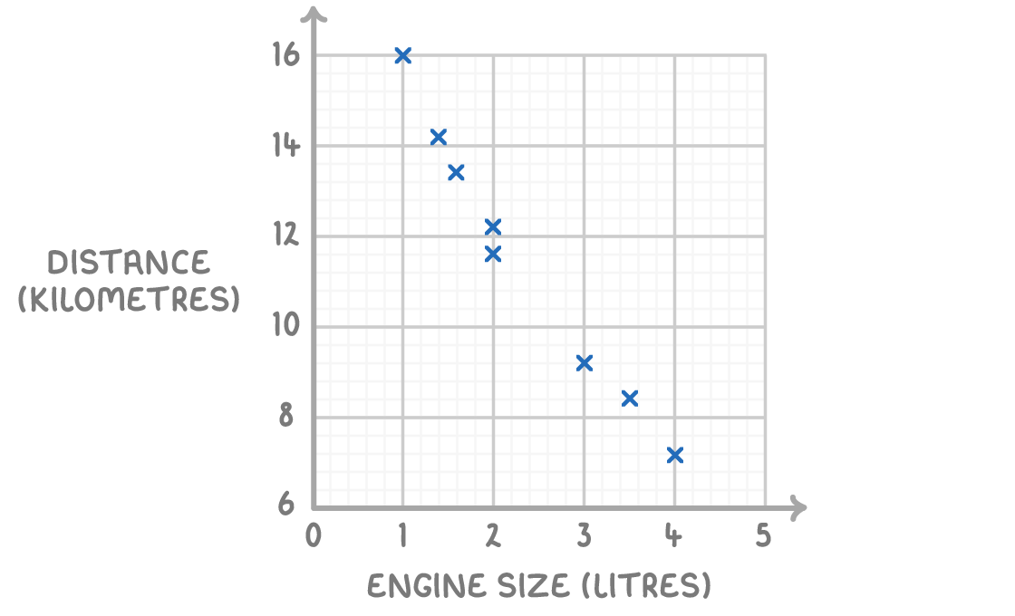
16 km
12 km
14 km
11 km
|
The average daytime temperature for 10 days is recorded. A shop also records its ice cream sales for each of the 110 days. The scatter graph shows this information.
Estimate the ice cream sales when the average temperature was 12°C.
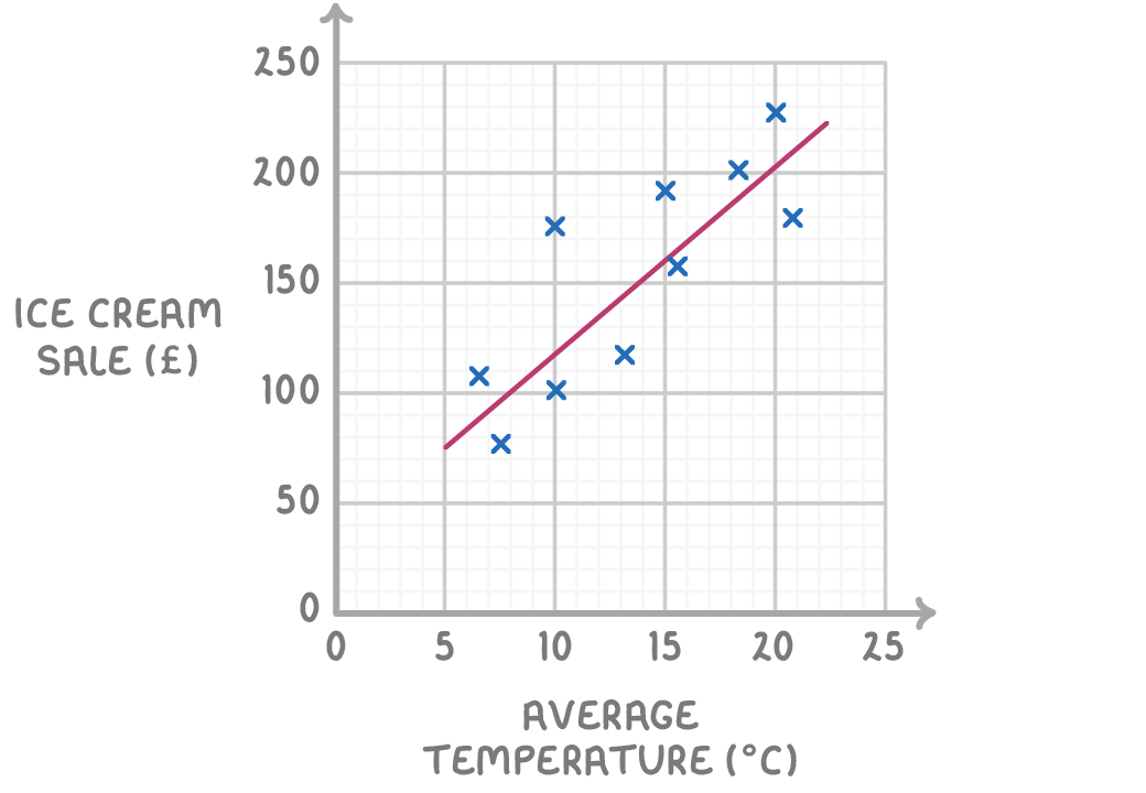
£68
£135
£101
£154
|