Histograms
This lesson covers:
- What a histogram is
- How to calculate frequency density
- Interpreting histograms
Introduction to histograms Histograms plot frequency density on their vertical axis to show how data is spread over various ranges, known as classes. 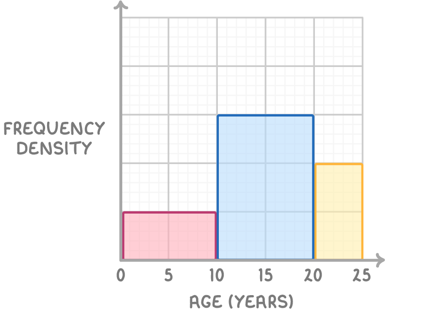 |
Class width Class width is the width of the bars on the histogram. It can be calculated using the formula: class width = highest value in class - lowest value in class |
Frequency Density Frequency density is the frequency per unit for the data in each class. It can be calculated using the formula: |
Frequency The number of times a value occurs. Frequency can be calculated using the rearranged formula: frequency = frequency density x class width |
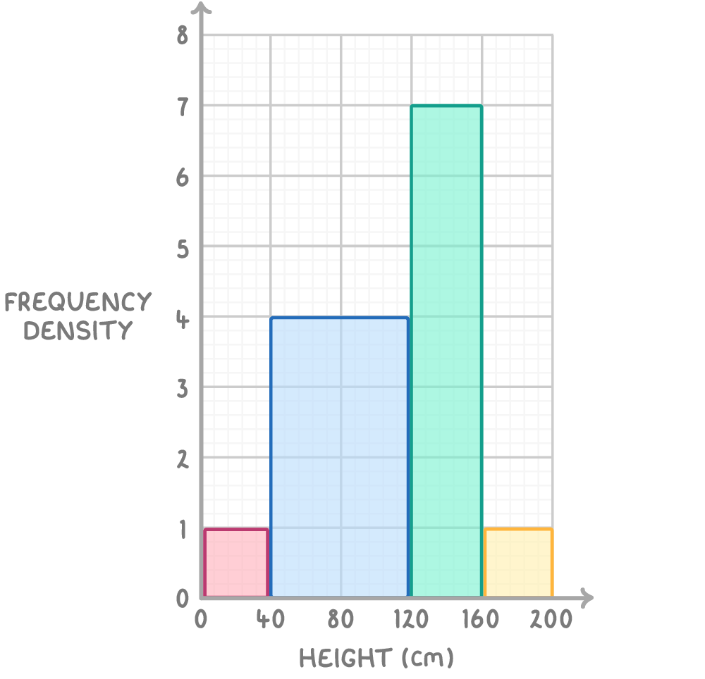
Worked example 1: Sunflower height survey
The following dataset records the height and frequency of sunflowers in a field. Find the missing frequency.
| height (cm) | Frequency |
|---|---|
| 0 < x ≤ 40 | 40 |
| 40 < x ≤ 120 | |
| 120 < x ≤ 160 | 280 |
| 160 < x ≤ 200 | 40 |
Worked example 2: Histogram of resale value.
Use the table below to plot a histogram of the resale value of some second hand cars.
| resale value | frequency | frequency density |
|---|---|---|
| 0 < p 5,000 | 4 | |
| 5000 < p 15,000 | 9 | |
| 15,000 < p 20,000 | 4 | |
| 20,000 < p 30,000 | 1 |
Calculate the missing frequency density in the table below.
| Number of points | Frequency | Frequency density |
|---|---|---|
| 0 < p 5 | 5 | 1 |
| 5 < p 12 | 6 | 0.86 |
| 12 < p 19 | 4 | 0.57 |
| 12 < p 25 | 2 | ? |
12.5
0.15
0.08
13
|
Calculate the missing frequency in the table below.
| Age (months) | Frequency | Frequency density |
|---|---|---|
| 0 < p 6 | ? | 1.5 |
| 6 < p 12 | 7 | 1.17 |
| 12 < p 24 | 12 | 1 |
| 24 < p 36 | 9 | 0.75 |
5
7
6
9
|
The table shows information about the time, in seconds, taken for some people to complete a puzzle.
| Time (seconds) | Frequency | Frequency density |
|---|---|---|
| 10 < t 20 | 12 | 0.8 |
| 25 < t 35 | 28 | |
| 35 < a 40 | 42 | 8.4 |
| 40 < a 45 | 30 | 6.0 |
| 45 < a 60 | 9 | 0.6 |
Use the information in the table to complete the histogram.
|
Worked example 2: Histogram of resale value.
Use the table below to plot a histogram of the resale value of some second hand cars.
| resale value | frequency | frequency density |
|---|---|---|
| 0 < p 5,000 | 4 | |
| 5000 < p 15,000 | 9 | |
| 15,000 < p 20,000 | 4 | |
| 20,000 < p 30,000 | 1 |